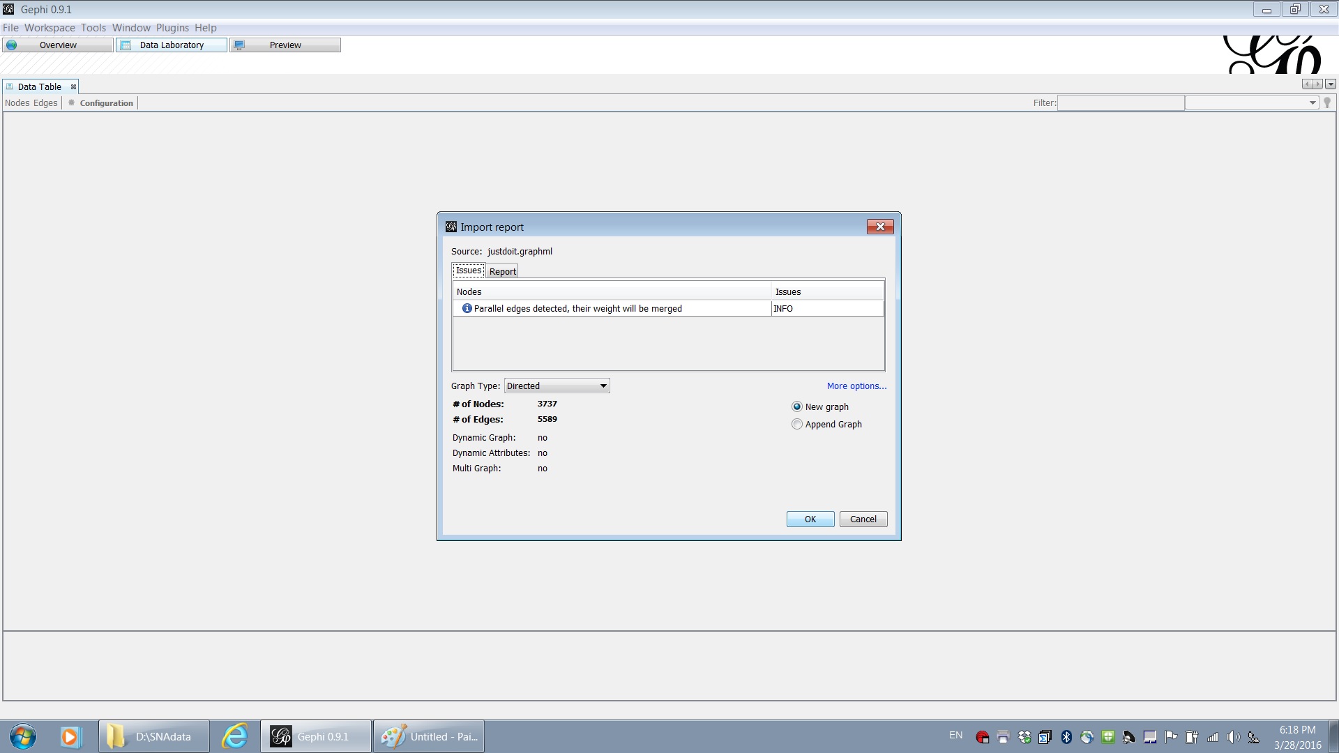
Visualization of social network data has provided an interesting approach to understand the diffusion of consumer information among customer network. In the following, I provide a step by step instruction of visualizing Nike’ s famous hash tag: #justdoit. I first collect all recent tweets that contain the hash tag of “justdoit” from Twitter. In the data, each twitter account that mentions the hash tag is treated as a node. If the tweet is a reply to another tweet or a mention of another tweet, an edge is added between the account and the other account. With the collected the data, we analyze the network and make a graph of the social network of reply/mention of hash tag “justdoit” in another free software, Gephi. You can enlarge the pictures in the following by click them.
(1) Open the data file in Gephi.
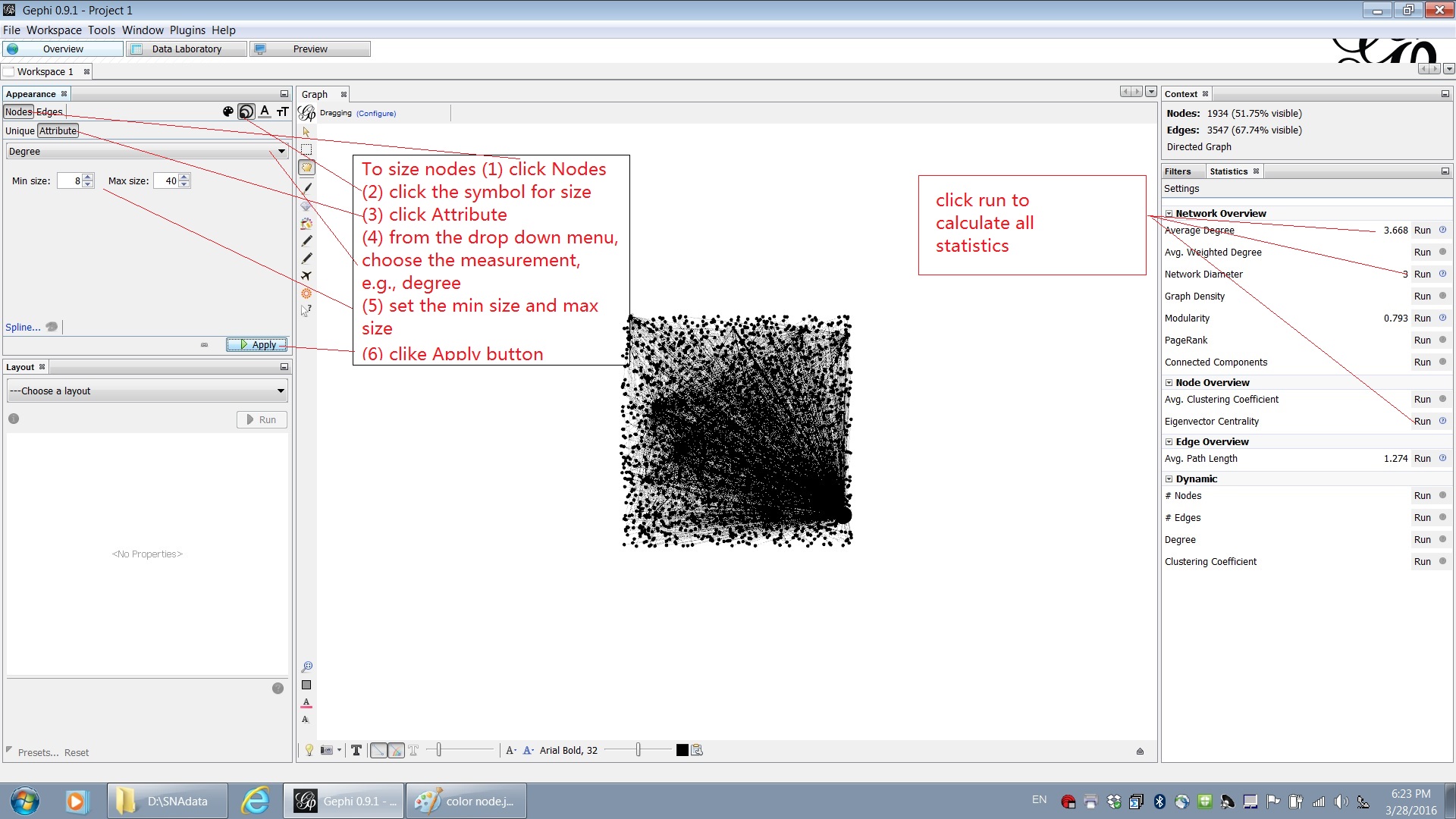
(2) Calculate statistics and size the nodes based on a measurement of centrality.
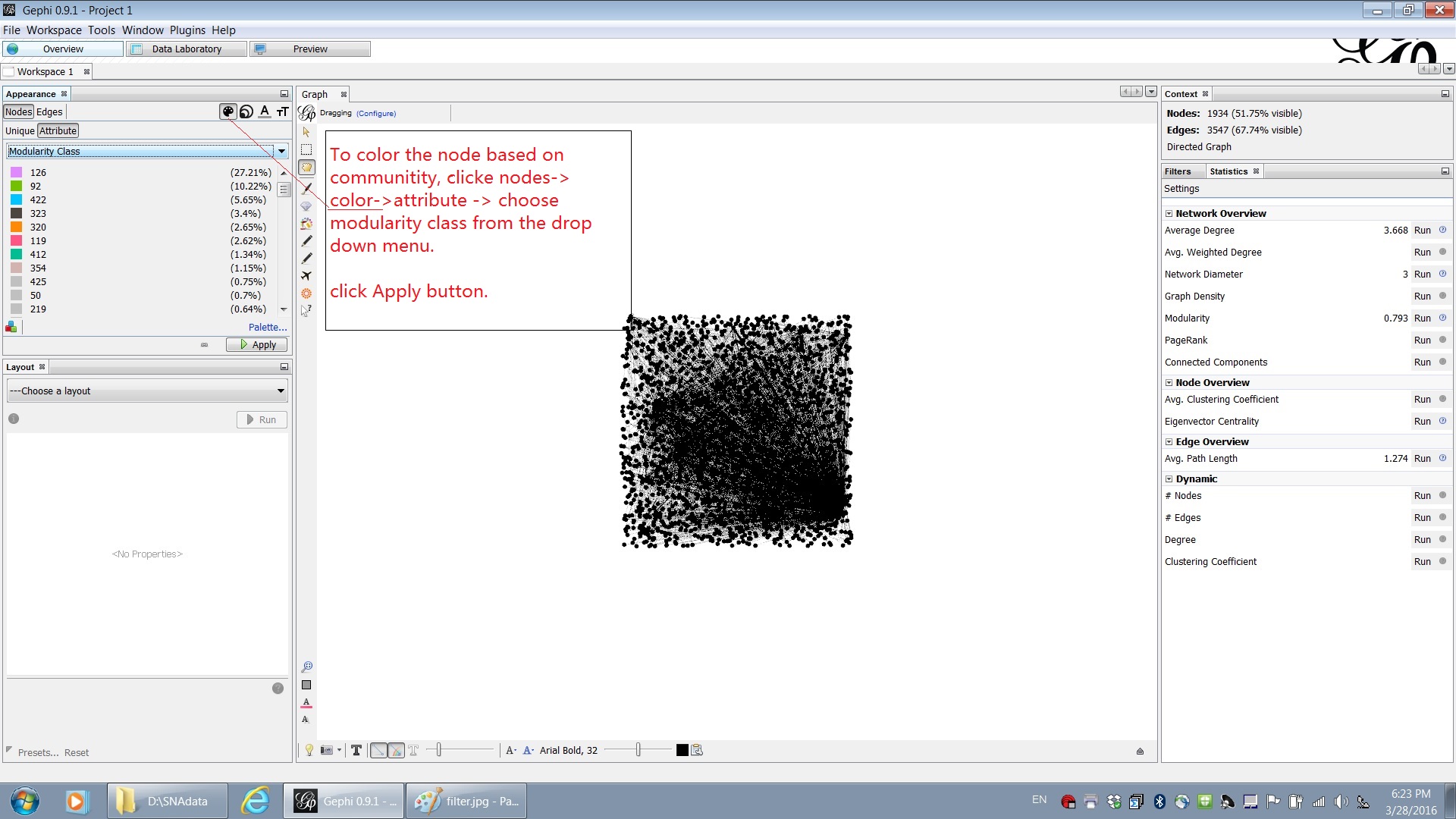
(3) Partition the network into several communities based on the calculated modularity.
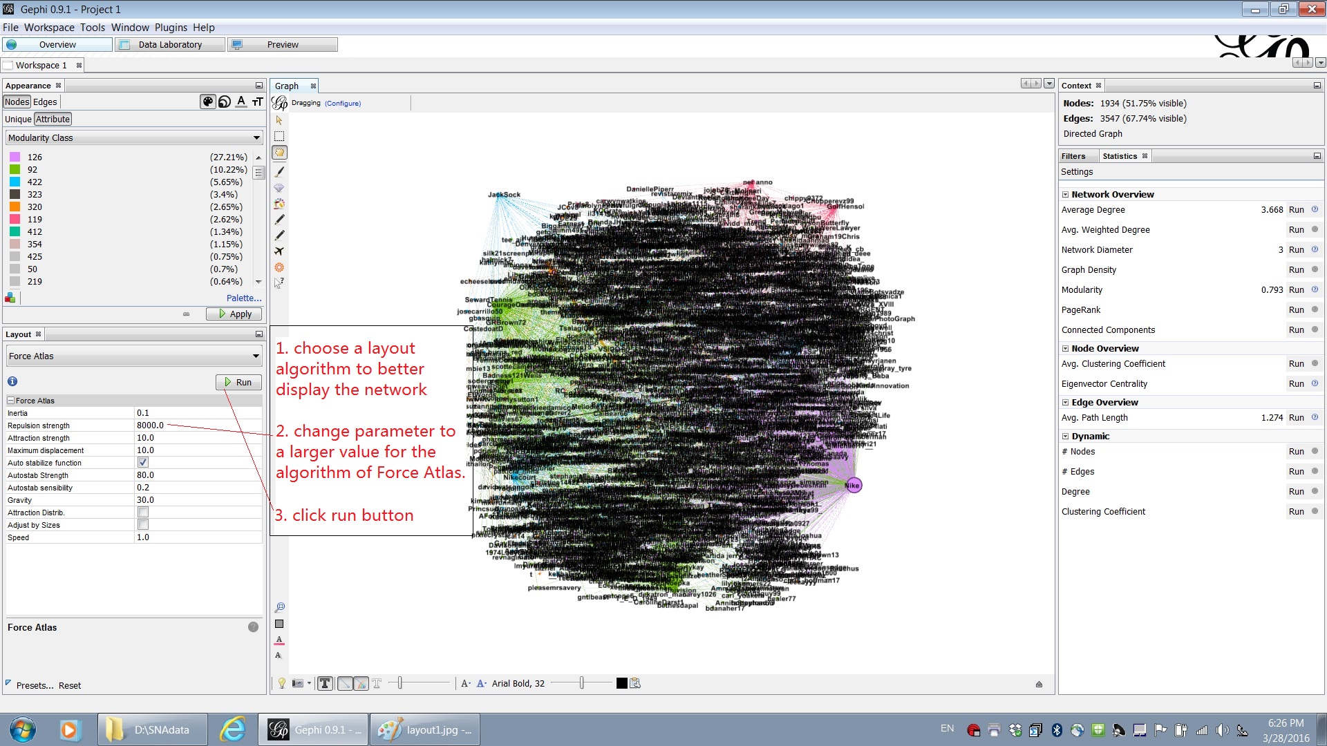
(4) Run a layout algorithm to get a better layout of nodes and edges.
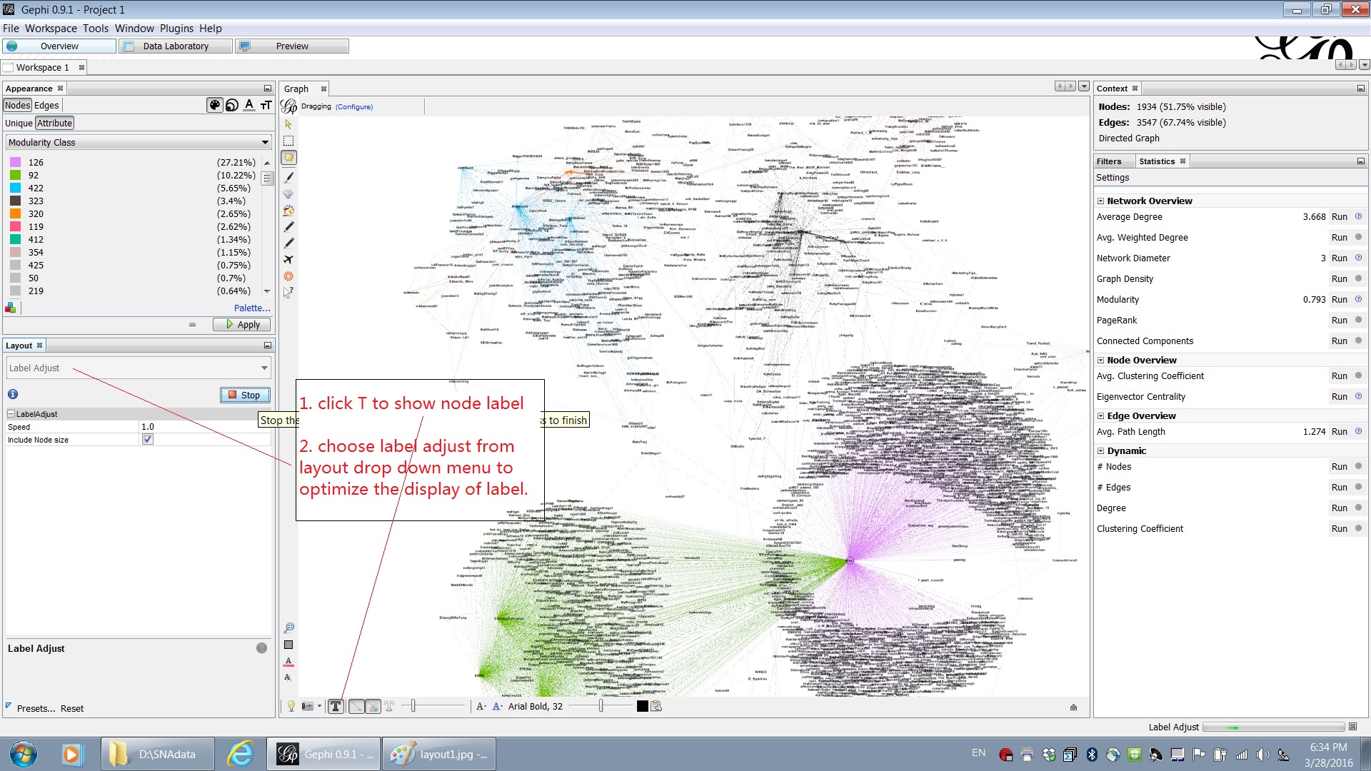
(5) Next, show the labels for nodes and run a label adjust algorithm.
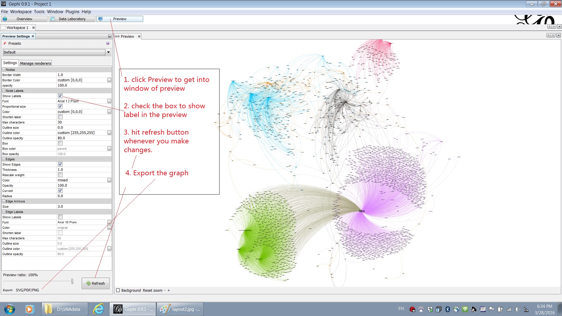
(6) To preview the graph, switch to the “Preview” window. To show the label, you need check the “Show Labels” box.
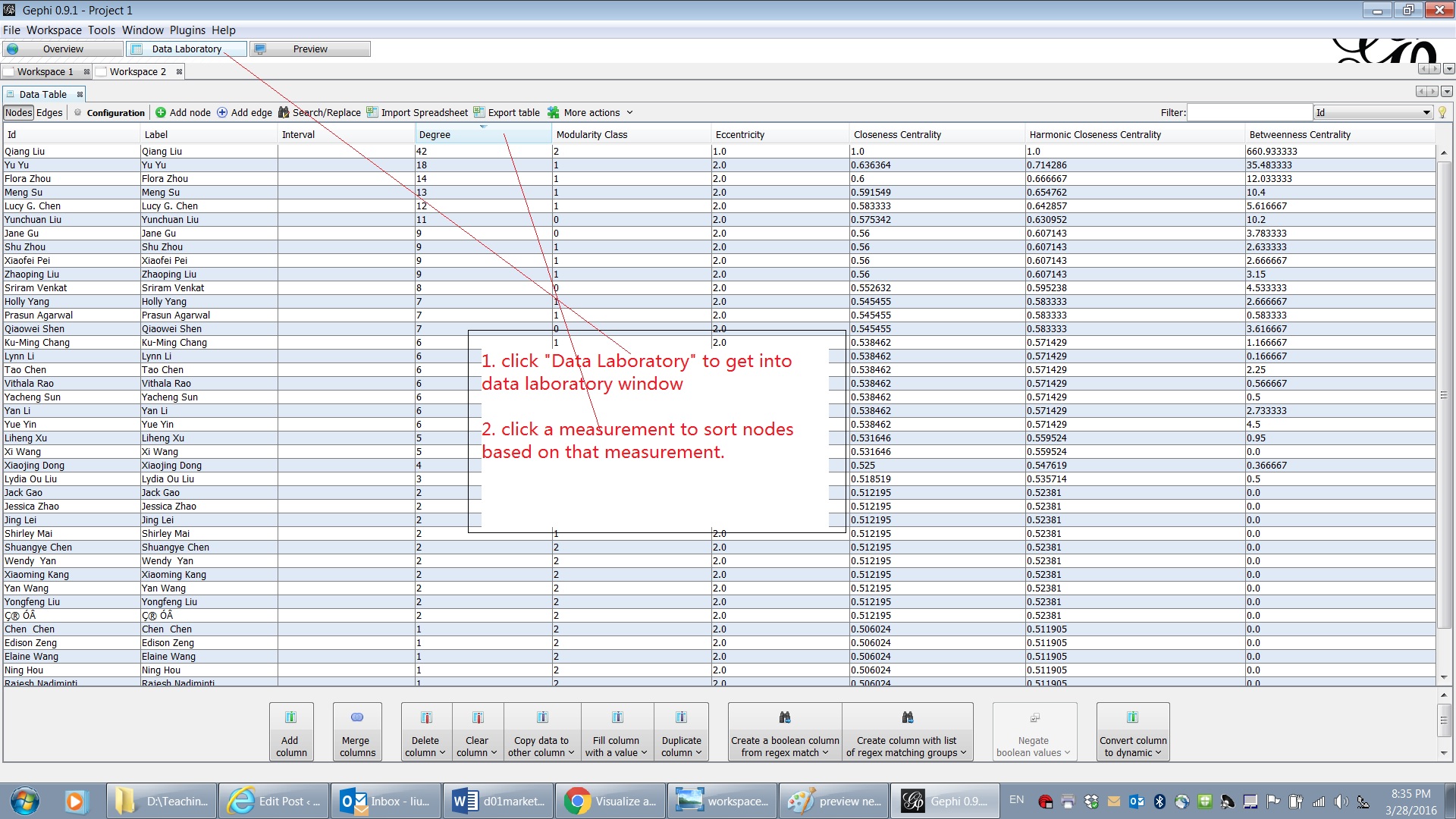
(7) In Data Laboratory window, you can sort the nodes based on some centrality measurement.